
BACKGROUND
(ID)
Tomoland telah berpengalaman mengembangkan berbagai proyek properti sejak 2009. Namun, selama ini fokus branding lebih menonjol pada masing-masing proyek perumahan, bukan pada brand Tomoland sebagai developer.
Tomoland telah berpengalaman mengembangkan berbagai proyek properti sejak 2009. Namun, selama ini fokus branding lebih menonjol pada masing-masing proyek perumahan, bukan pada brand Tomoland sebagai developer.
(EN)
Tomoland has been developing multiple property projects since 2009. However, its branding efforts have primarily focused on individual housing projects rather than establishing Tomoland as a developer brand.
Tomoland has been developing multiple property projects since 2009. However, its branding efforts have primarily focused on individual housing projects rather than establishing Tomoland as a developer brand.

PROBLEM
(ID)
Meski sudah lama beroperasi dan memiliki banyak proyek, Tomoland belum memiliki identitas brand yang kuat dan konsisten di benak masyarakat sebagai sebuah pengembang properti.
Meski sudah lama beroperasi dan memiliki banyak proyek, Tomoland belum memiliki identitas brand yang kuat dan konsisten di benak masyarakat sebagai sebuah pengembang properti.
(EN)
Despite years of experience and numerous projects, Tomoland lacks a strong and consistent brand identity in the public’s perception as a property developer.
Despite years of experience and numerous projects, Tomoland lacks a strong and consistent brand identity in the public’s perception as a property developer.
GOALS
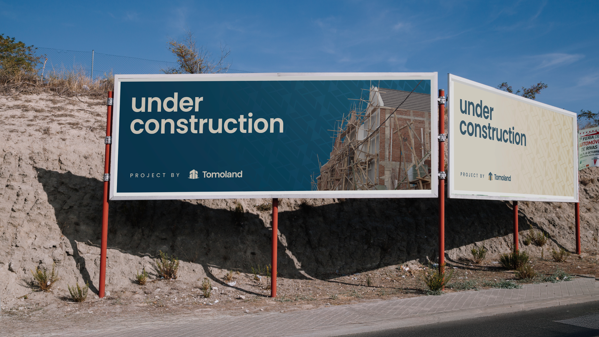
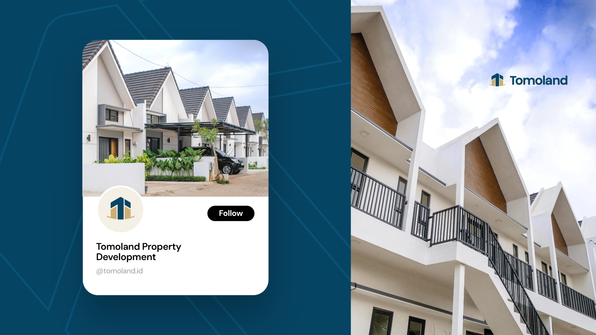
Memperkuat posisi Tomoland sebagai brand developer premium melalui pendekatan light rebranding, tanpa menghilangkan reputasi dan kepercayaan yang telah dibangun sebelumnya.
(EN)
To strengthen Tomoland’s position as a premium property developer through a light rebranding approach, while preserving the trust and reputation built over the years.
To strengthen Tomoland’s position as a premium property developer through a light rebranding approach, while preserving the trust and reputation built over the years.
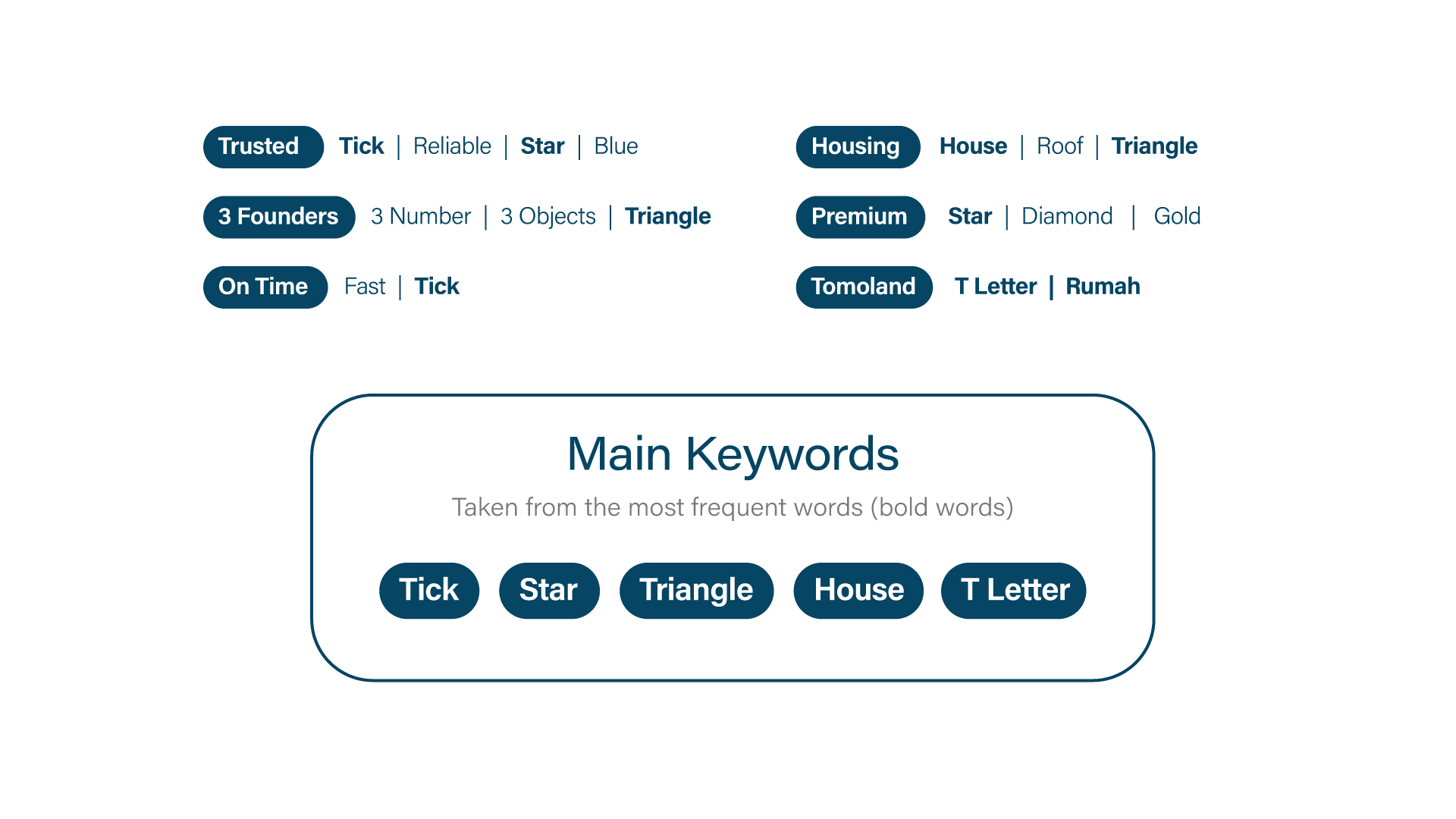
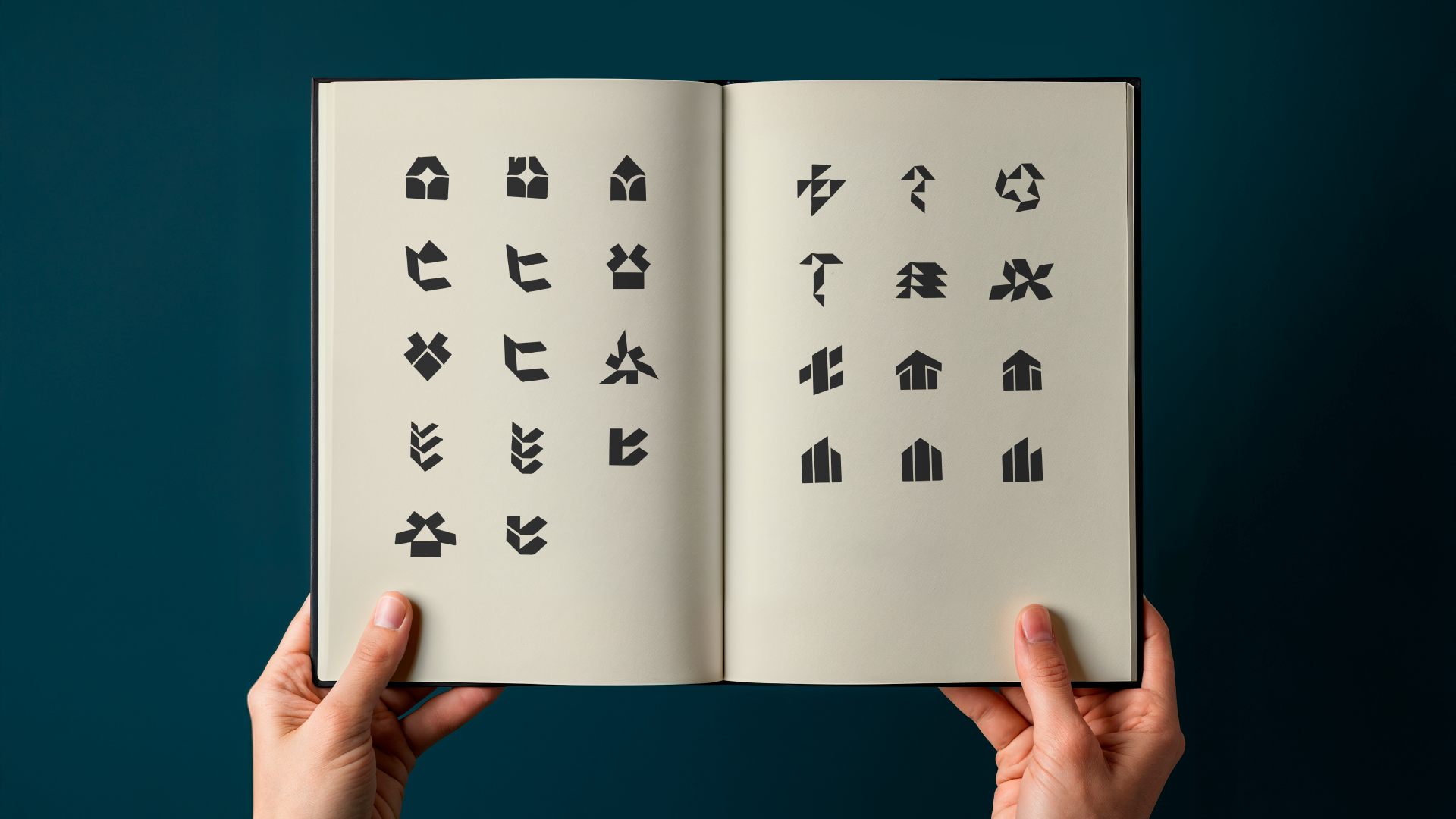
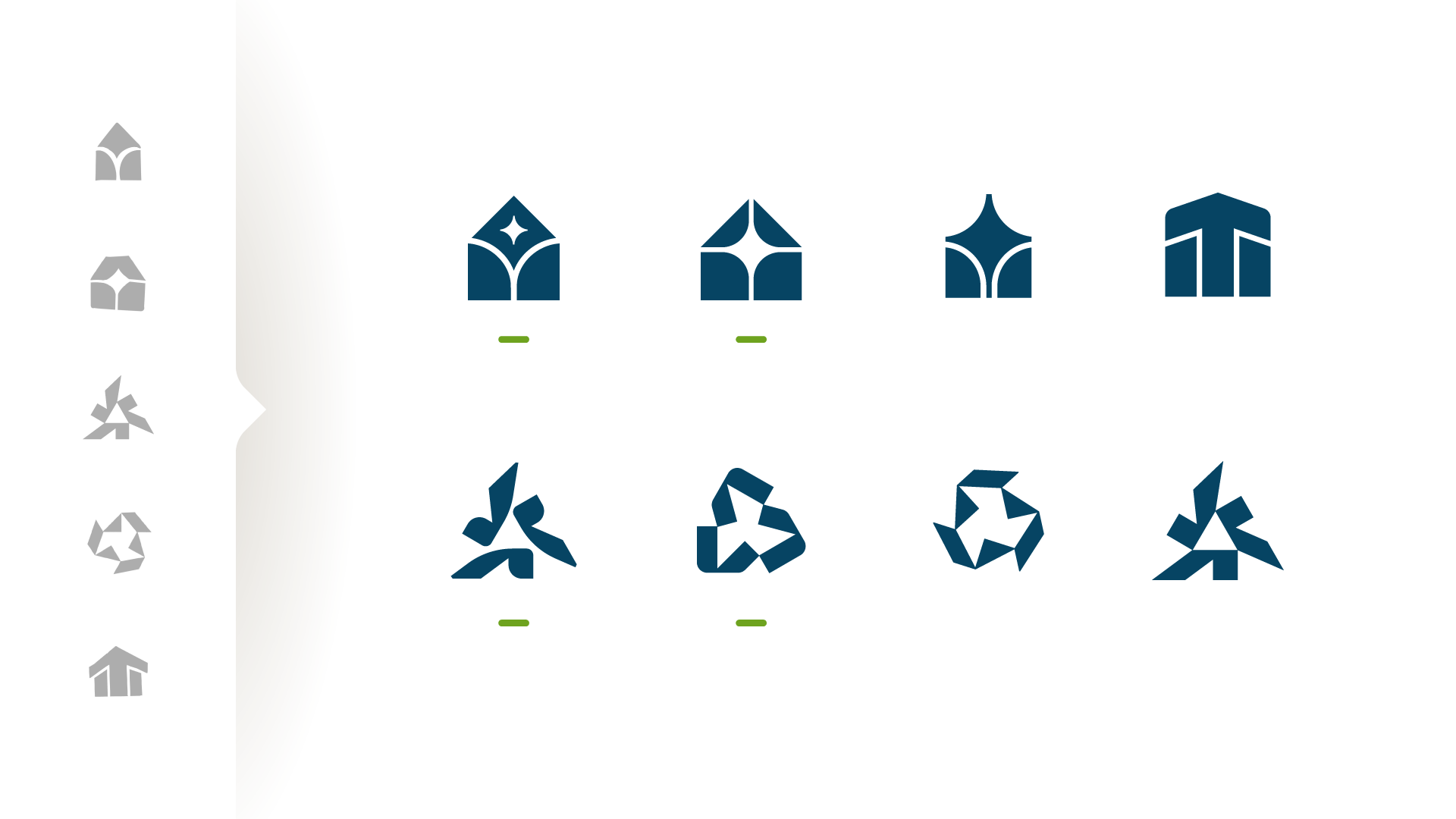
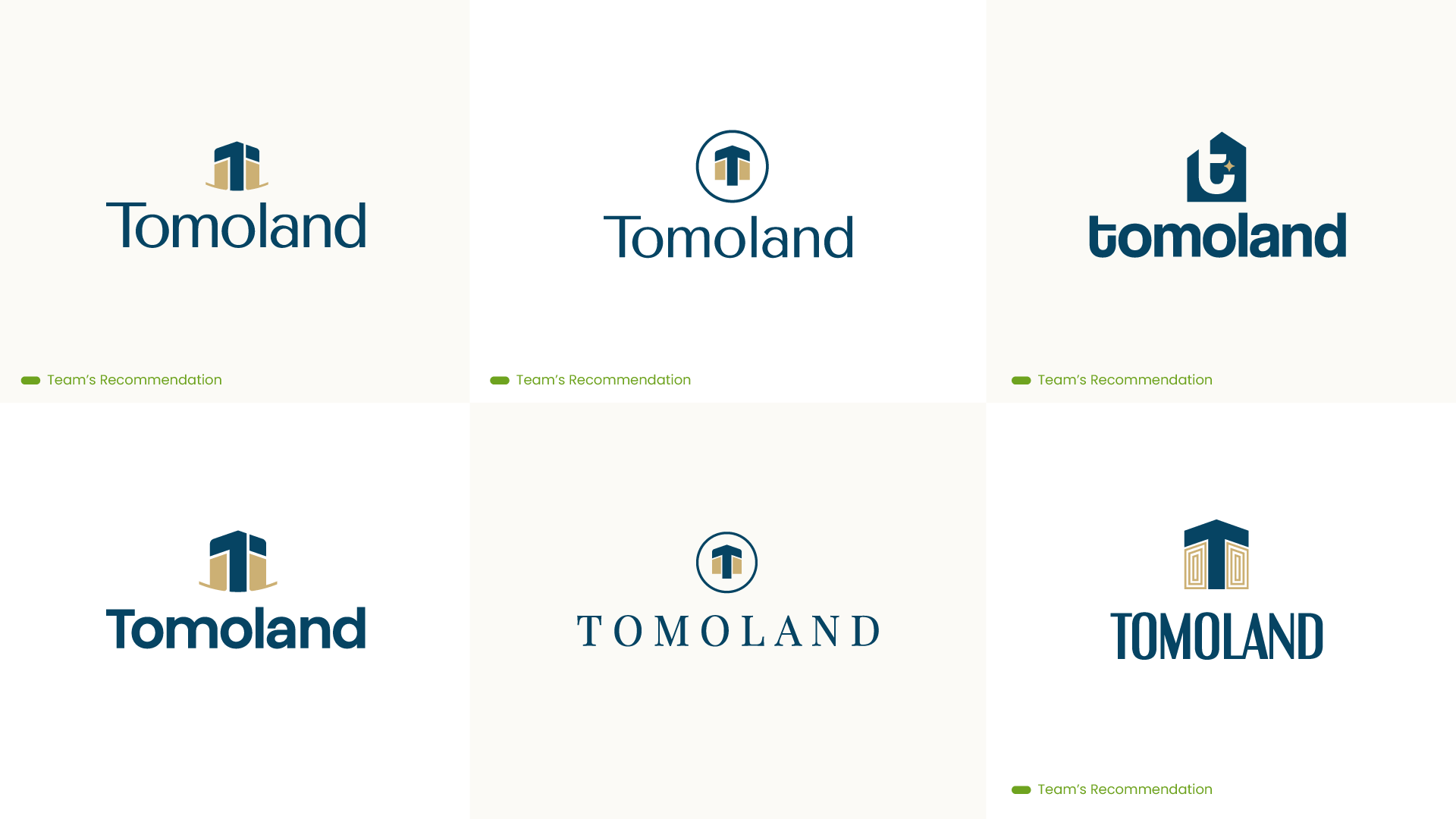
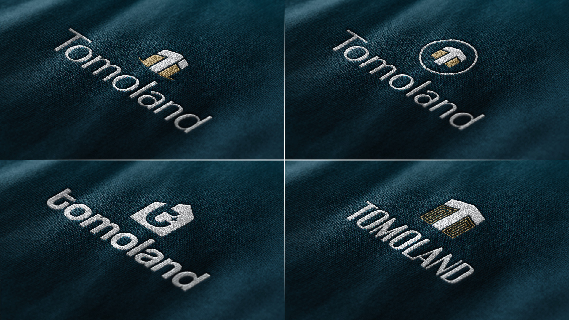
Digitalisasi : Hasil vector bertanda hijau adalah opsi yang kami rekomendasikan ke klien. Tapi semua proses mulai dari sketsa juga dikirimkan
Digitalization Process : The vectors marked with green indicators were our recommended options for the client. However, the entire process, including initial sketches was also shared to maintain transparency.
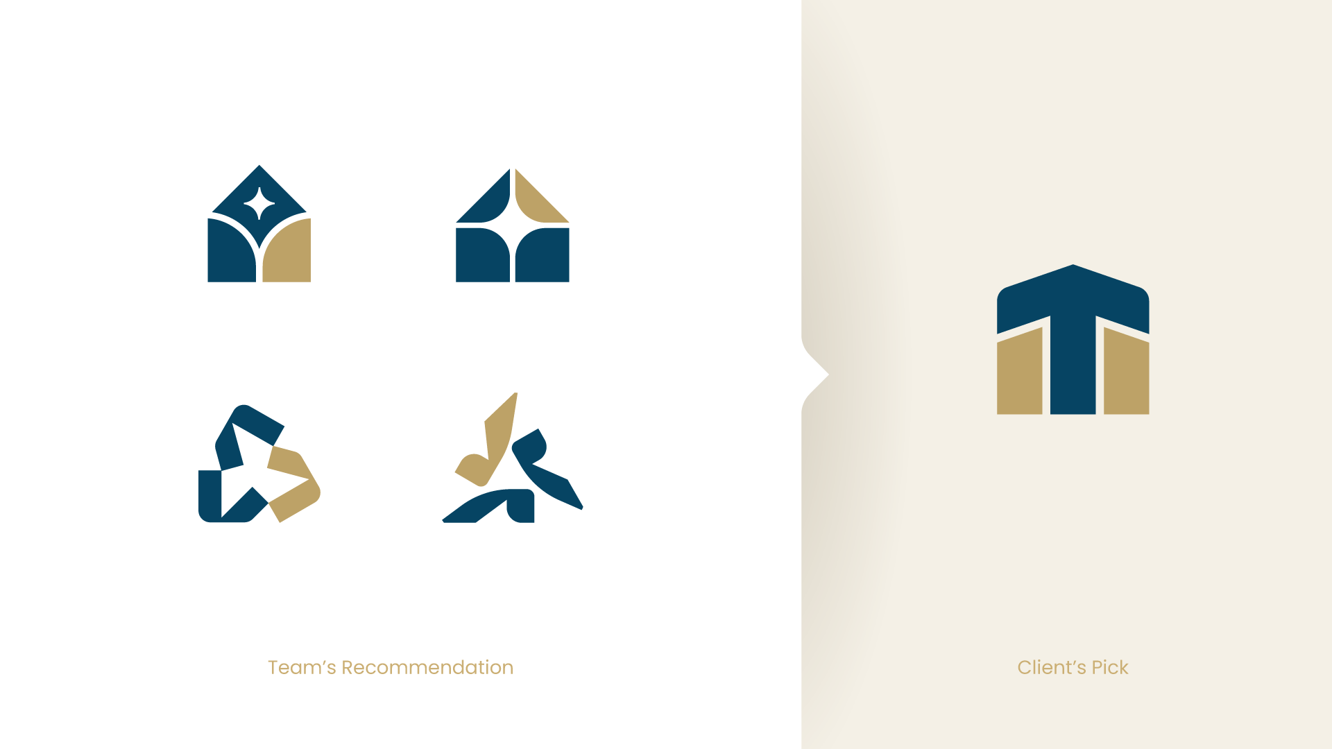
Klien akhirnya memilih opsi ini meskipun terdapat beberapa catatan dari tim kami, terutama terkait bentuk yang dinilai cukup generik untuk pasar perumahan serta kemiripan visual dengan Ka’bah. Kedua hal tersebut telah disampaikan, namun keputusan tetap tidak berubah dan menjadi bagian dari kompromi dalam proses desain.
The client ultimately selected this option despite several concerns raised by our team, particularly regarding its relatively generic form for the housing market and its visual resemblance to the Kaaba. These considerations were communicated clearly and became part of the design compromise moving forward.
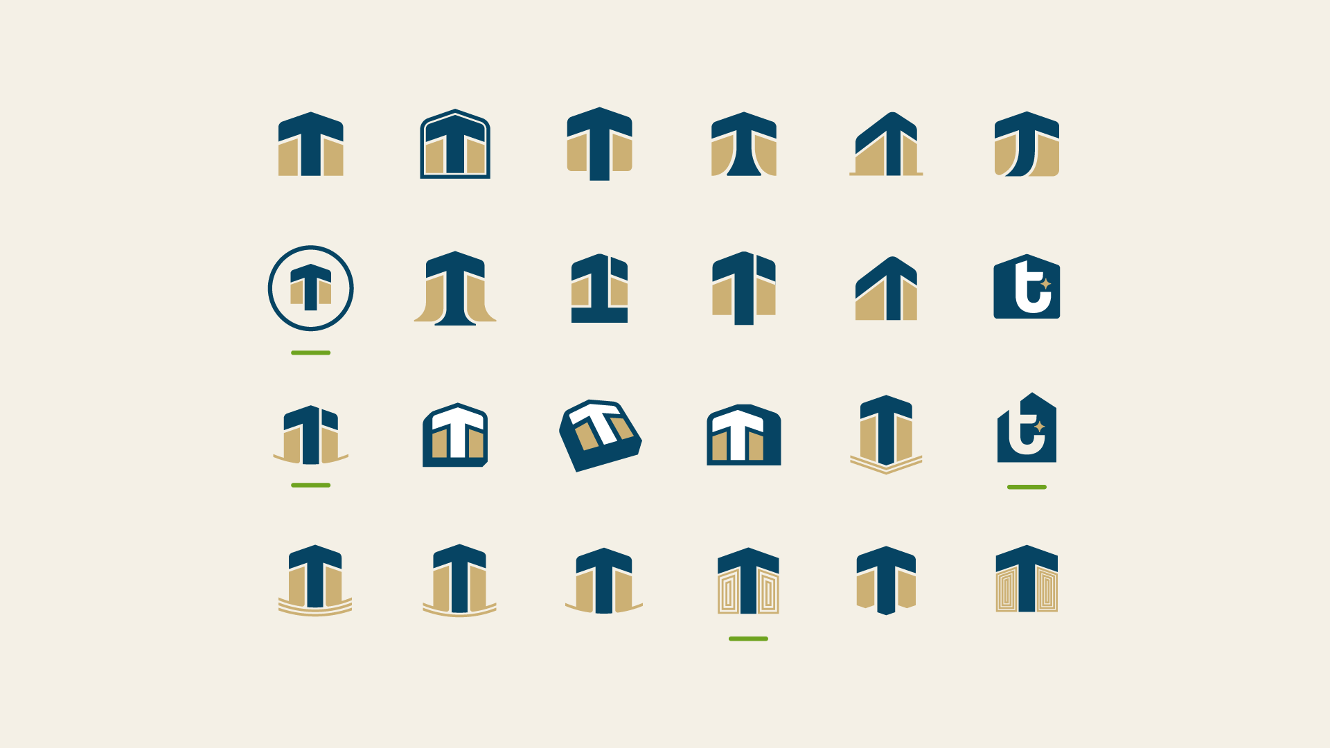
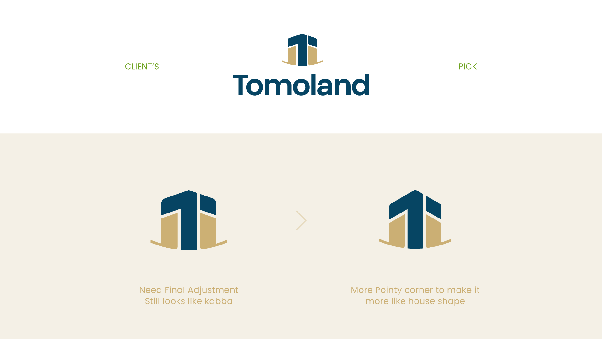
Penyesuaian akhir dilakukan pada sudut logo untuk memperkuat kesan rumah dibandingkan asosiasi dengan Ka’bah. Konsekuensinya, huruf “T” mengalami sedikit distorsi. Sebuah kompromi yang kami ambil dalam proses desain.
Final angle refinements were made to emphasize the house impression over the Kaaba association. As a result, the “T” letterform became slightly distorted—an intentional compromise within the design process.
CREDITS
Art Director Didya Ilyas Muqaffi
Logo & Visual Identity Adnan Mardiyansyah, Didya Ilyas Muqaffi
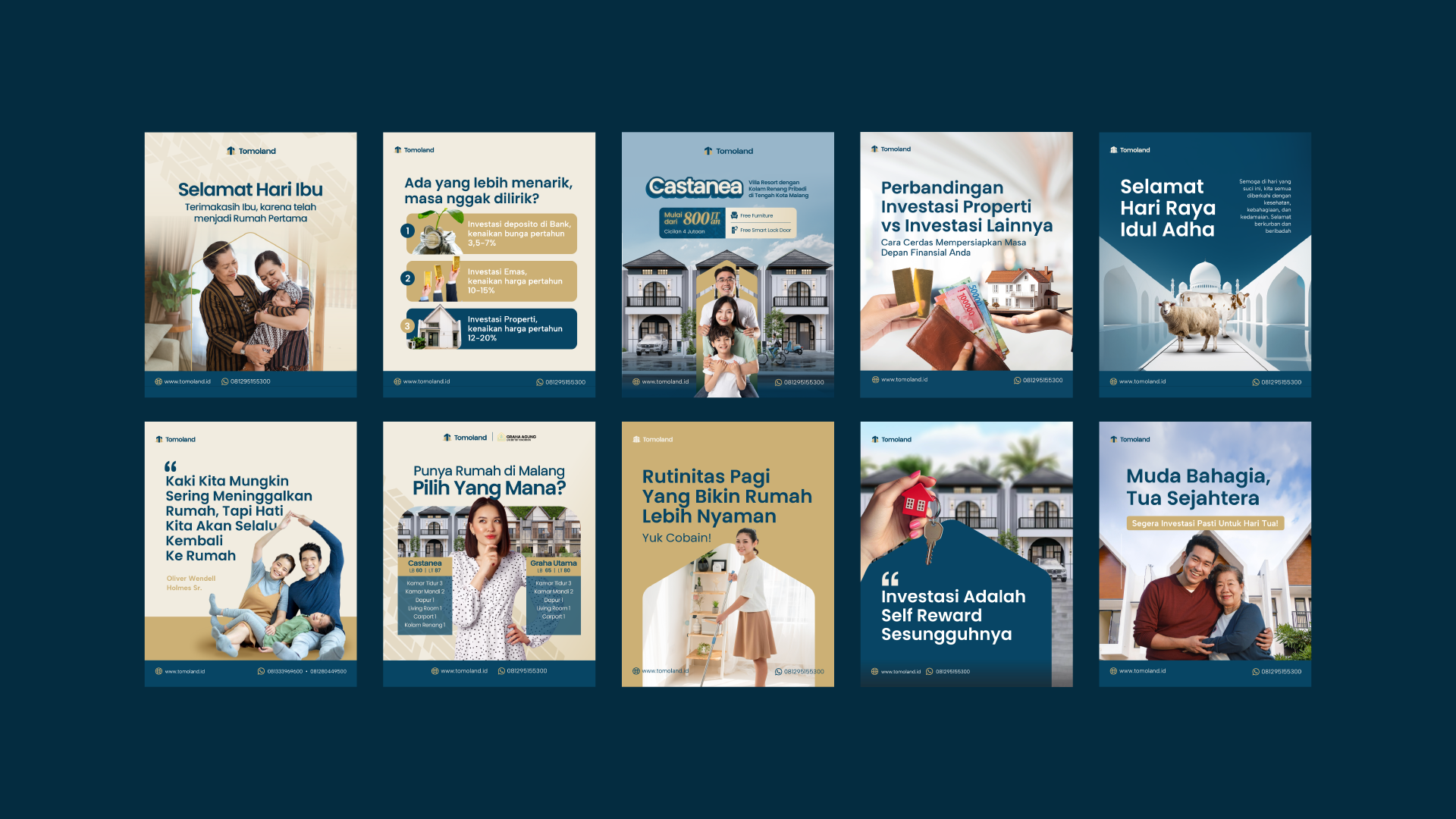
Social Media Designer Adnan Mardiyansyah, Vena Devananda
Motion Graphic Adam Wimaldy
Content Writer Rizka Prihapsari
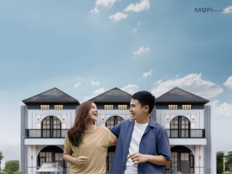
Photography Yusril Naufal
Logo & Visual Identity Adnan Mardiyansyah, Didya Ilyas Muqaffi
Social Media Designer Adnan Mardiyansyah, Vena Devananda
Motion Graphic Adam Wimaldy
Content Writer Rizka Prihapsari
Photography Yusril Naufal