
Momify (2025)
Logo Design | Visual Identity
BACKGROUND
ID
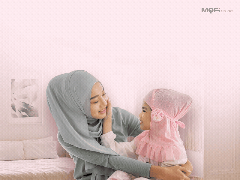
Momify adalah brand edukasi ibu yang hadir sebagai ruang aman berbasis ilmu, dengan konten yang ditinjau expert. Melalui buku, kelas, komunitas, hingga layanan konsultasi, Mommify menemani setiap fase motherhood dengan pendekatan hangat dan tanpa judgement.
EN
Momify is an educational brand for mothers, positioned as a science-based safe space with expert-reviewed content. Through books, classes, community programs, and consultation services, Mommify supports every phase of motherhood with a warm, non-judgmental approach.

GOALS
ID
Menyegarkan identitas Mommify dan menyesuaikannya dengan arah brand yang berkembang.
EN
Refreshing Mommify’s identity to align with the brand’s evolving direction.

CHALLENGE
ID
menghadirkan tampilan baru yang lebih relevan tanpa menghilangkan kedekatan visual yang sudah dikenal komunitasnya.
EN
Introducing a more relevant look without losing the visual familiarity trusted by its community.
AFTER COMPARATIVE ANALYSIS
ID
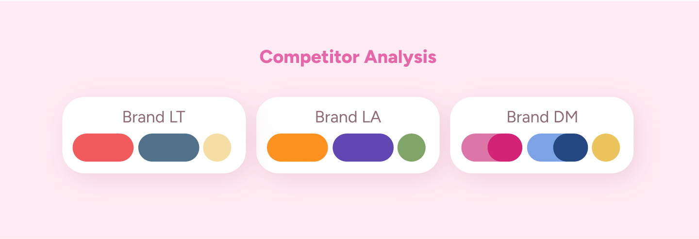
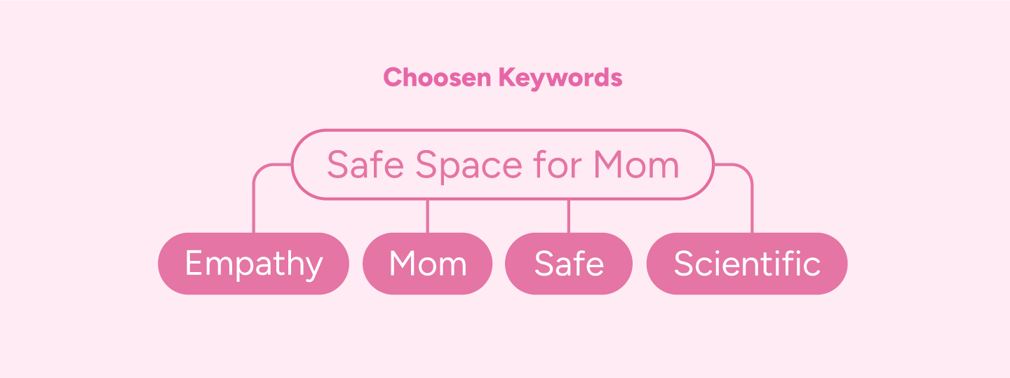
Hal paling unik dari Momify adalah Mommy-Sentris, Topik untuk ibu, tentang ibu, dan rasa empati untuk ibu. Berbeda dengan brand lainnya yang lebih condong “topik seputar anak untuk ibu (dan ayah)”
EN
What makes Mommify unique is its mother-centric approach—topics for mothers, about mothers, with deep empathy for mothers. This sets Mommify apart from other brands that tend to focus more on child-related topics for parents
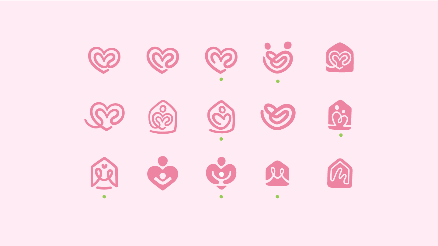
DIGITALIZING SKETCH
ID
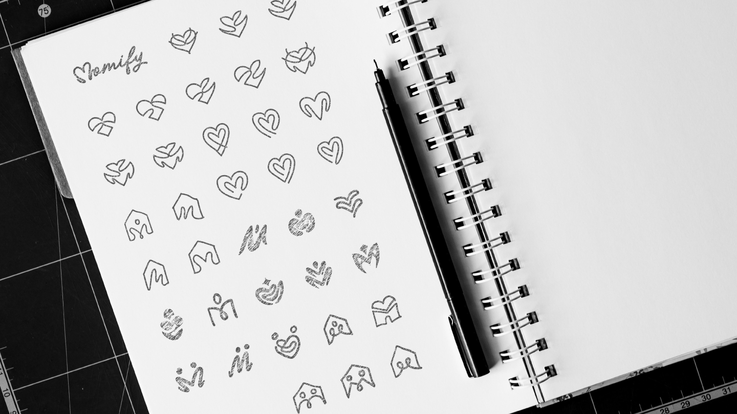
Kami pilih beberapa sketsa yang paling representatif dan potensial untuk selanjutnya kami digitalisasi dengan pendekatan visual ke bentuk organik dan imperfect untuk menciptakan kesan warm, manusiawi, dan empatik
EN
We selected the most representative and promising sketches to be further digitized, using an organic and imperfect visual approach to convey warmth, humanity, and empathy.
INTERNAL REVIEW
ID
Kami menyeleksi lagi hasil digitalisasi untuk dikerucutkan dan dikirimkan ke klien. Opsi bertanda hijau adalah desain yang kami rasa cukup baik
EN
We further curated the digitized designs and narrowed them down for client presentation. The options marked in green were considered strong candidates.
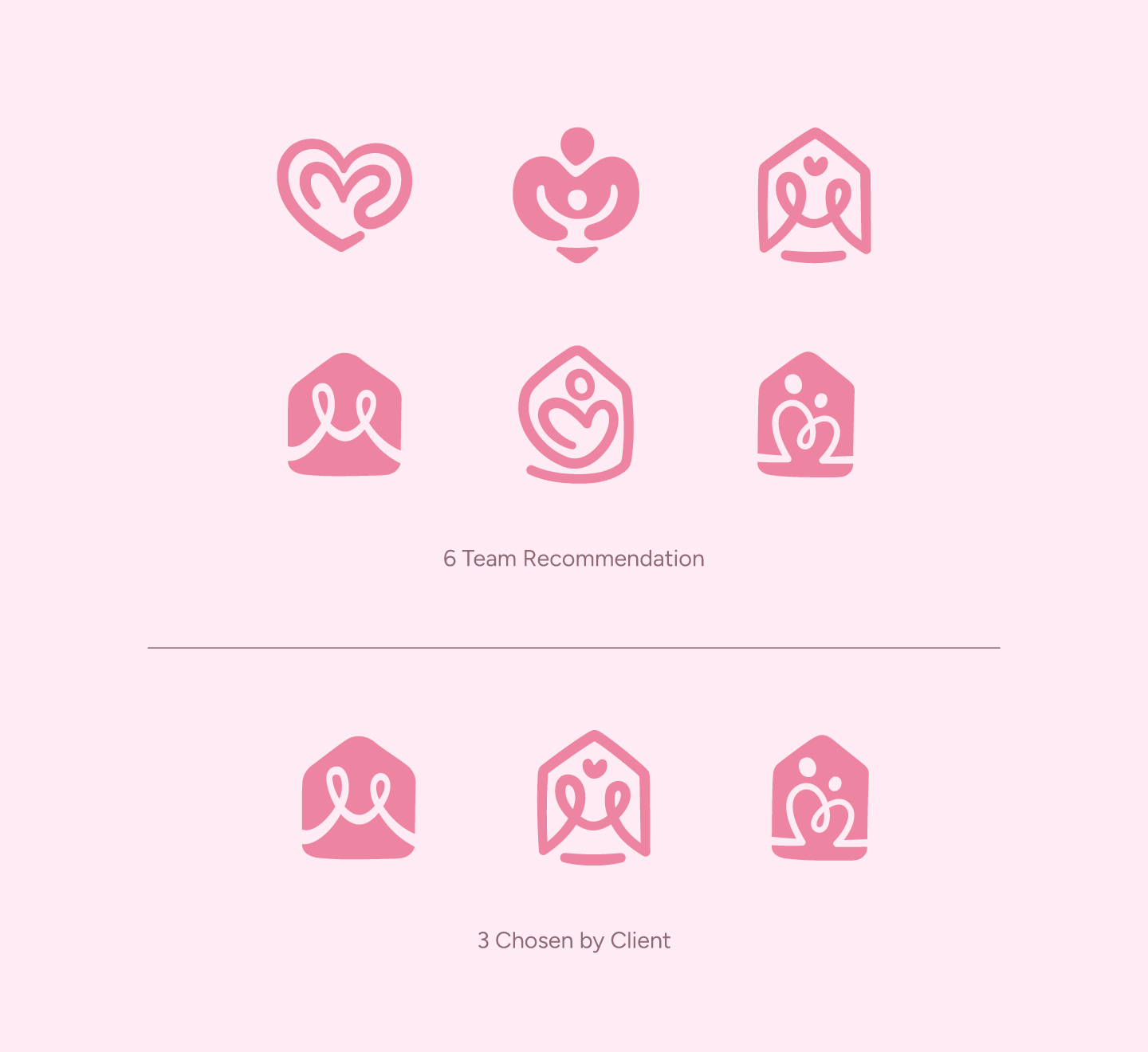
ID
Dari 3 desain yang dipilih oleh klien, kami lanjutkan prosesnya dengan proses pairing logotype dan merekomendasikan warna yang unik daripada kompetitor tapi tetap selaras dengan tujuan
EN
From the three selected designs, we continued the process by pairing the logotype and recommending a color palette that stands out from competitors while staying aligned with the brand’s goals.
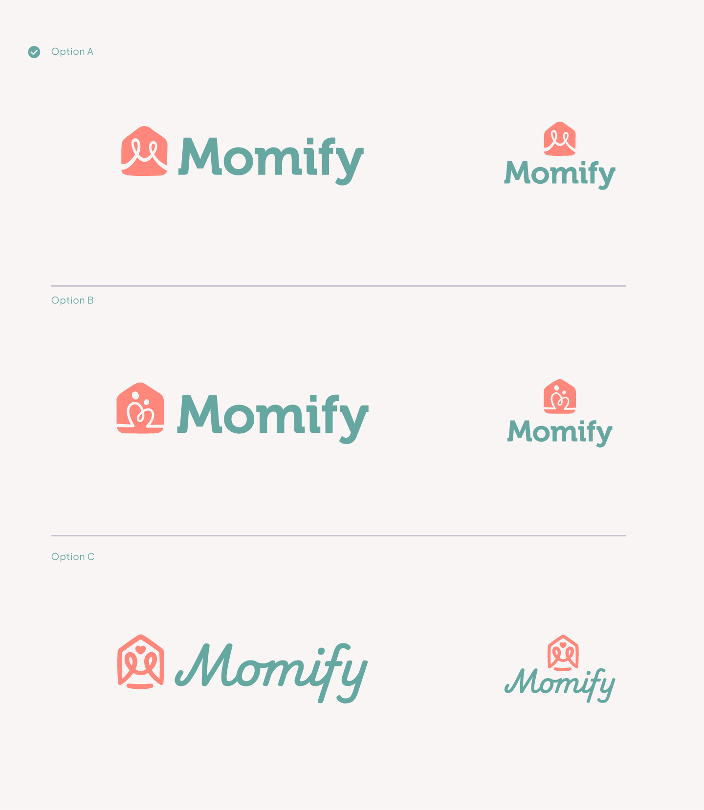
FURTHER COLOR EXPLORATION
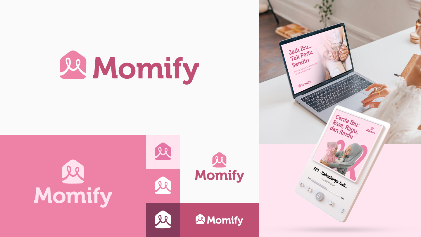
ID
Option A adalah desain logo yang disetujui oleh klien. Namun karena tim klien kurang setuju dengan warna yang kami sarankan dengan alasan tertentu, kami berikan opsi warna lain yang mendekati color pallete sebelumnya
EN
Option A was approved as the final logo. However, due to specific considerations from the client team regarding the proposed colors, we provided alternative color options that remain close to the original palette.
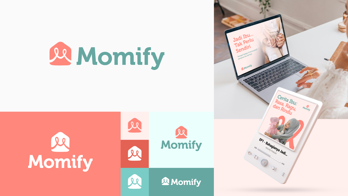
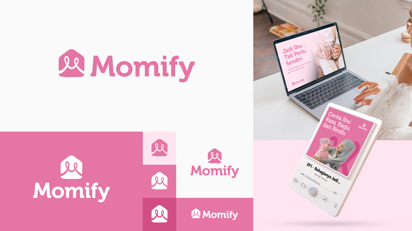
CLIENT'S APPROVAL
ID
Walaupun sudah mencoba lagi untuk merekomendasikan ulang saran warna dari kami lewat beberapa mockup, akhirnya pilihan tim klien jatuh pada Opsi 2
EN
After re-proposing our color direction across multiple mockups, the client team decided to move forward with Option 2.
CREDITS
Art Director : Didya Ilyas Muqaffi
Graphic Design : Adnan Mardiyansyah, Didya Ilyas Muqaffi
Motion Graphic : Adam Wimaldy